一、简介
styled components一种全新的控制样式的编程方式,它能解决CSS全局作用域的问题,而且移除了样式和组件间的映射关系
- 我们要理清一件事情:
styled-components 只是 CSS 层面的高度抽象。它只是解析定义在 JavaScript 中的 CSS,然后生成对应 CSS 的 JSX 元素
import React from 'react';
import styled from 'styled-components';
import { render } from 'react-dom';
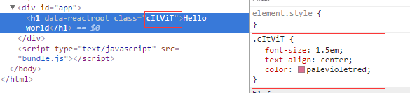
const Title = styled.h1`
font-size: 1.5em;
text-align: center;
color: palevioletred;
`;
WrapSearchBox=styled.div`
width : 200px;
// 媒体查询
@media (max-width : 800px){
width : 100%;
padding-left:15px;
margin-top:-14px;
}
>div{
@media (max-width : 800px){
width : 100% !important;
}
}
>div>input {
width:200px !important;
padding-left:25px !important;
@media (max-width : 800px){
width : 100% !important;
}
}
`
class App extends React.Component {
render() {
return (
<Title>Hello world</Title>
)
}
}
render(
<App />,
document.getElementById('app')
);
|
styled.h1函数返回一个React Component,styled components会为这个React Component添加一个class,该class的值为一个随机字符串。传给styled.h1的模板字符串参数的值实际上是CSS语法,这些CSS会附加到该React Component的class中,从而为React Component添加样式
二、基于 props 定制主题
const Button = styled.button`
  background: ${props => props.primary ? 'palevioletred' : 'white'};
  color: ${props => props.primary ? 'white' : 'palevioletred'};
  font-size: 1em;
  margin: 1em;
  padding: 0.25em 1em;
  border: 2px solid palevioletred;
  border-radius: 3px;
`;

render(
  <div>
    <Button>Normal</Button>
    <Button primary>Primary</Button>
  </div>
);
|
export const StyledSlider = styled(Slider)`
	${props => {
		const theme = props.theme.slider;

		return css`
			div.rc-slider-track {
				background-color: ${theme.themeColor};
			}
			div.rc-slider-handle {
				border: 2px solid ${theme.themeColor};
			}
			span.rc-slider-dot-active {
				border-color: ${theme.themeColor};
			}
		`;
	}}
`;
|
export const SmallSelectWrapper = styled.div `

  // div下面的类样式
  .Select-control {
    height: 30px;
  }
  .Select-input {
    height: 28px;
  }
  .Select-value,
  .Select-placeholder {
    line-height: 28px !important;
  }
  .Select-menu-outer {
    max-height: 270px;
    .Select-option.is-disabled {
      cursor: default;
      padding-left: .5em;
      font-weight: bold;
      color: #333;
      background: #f8f8f8;
    }
  }
  .Select-menu {
    max-height:268px;
  }
  text-align: left;
`
|
我们在组件中传入的所有 props 都可以在定义组件时获取到,这样就可以很容易实现组件主题的定制。如果没有 styled-components 的情况下,需要使用组件 style 属性或者定义多个 class 的方式来实现
三、组件样式继承
通常在 css 中一般会通过给 class 传入多个 name 通过空格分隔的方式来复用 class 定义,类似 class="button tomato"。在 styled-components 中利用了 js 的继承实现了这种样式的复用:
const Button = styled.button`
  color: palevioletred;
  font-size: 1em;
  margin: 1em;
  padding: 0.25em 1em;
  border: 2px solid palevioletred;
  border-radius: 3px;
`;

const TomatoButton = Button.extend`
  color: tomato;
  border-color: tomato;
`;
|
子组件中的属性会覆盖父组件中同名的属性
四、组件内部使用 className
在日常开发中总会出现覆盖组件内部样式的需求,你可能想在 styled-components 中使用 className,或者在使用第三方组件时。
<Wrapper>
  <h4>Hello Word</h4>
  <div className="detail"></div>
</Wrapper>
|
五、组件中维护其他属性
styled-components 同时支持为组件传入 html 元素的其他属性,比如为 input 元素指定一个 type 属性,我们可以使用 attrs 方法来完成
const Password = styled.input.attrs({
  type: 'password',
})`
  color: palevioletred;
  font-size: 1em;
  border: 2px solid palevioletred;
  border-radius: 3px;
`;
|
- 在实际开发中,这个方法还有一个有用处,用来引用第三方类库的
css 样式:
const Button = styled.button.attrs({
  className: 'small',
})`
  background: black;
  color: white;
  cursor: pointer;
  margin: 1em;
  padding: 0.25em 1em;
  border: 2px solid black;
  border-radius: 3px;
`;
|
<button class="sc-gPEVay small gYllyG">
  Styled Components
</button>
|
可以用这种方式来使用在别处定义的 small 样式,或者单纯为了识别自己定义的 class,因为正常情况下我们得到的 class 名是不可读的编码
六、CSS 动画支持
styled-components 同样对 css 动画中的 @keyframe 做了很好的支持。
import { keyframes } from 'styled-components';
const fadeIn = keyframes`
  0% {
    opacity: 0;
  }
  100% {
    opacity: 1;
  }
`;

const FadeInButton = styled.button`
  animation: 1s ${fadeIn} ease-out;
`;
|
七、兼容现在已有的 react components 和 css 框架
styled-components 采用的 css-module 的模式有另外一个好处就是可以很好的与其他的主题库进行兼容。因为大部分的 css 框架或者css主题都是以 className 的方式进行样式处理的,额外的 className 和主题的 className 并不会有太大的冲突
styled-components 的语法同样支持对一个 React 组件进行扩展
const StyledDiv = styled(Row)`
  position: relative;
  height: 100%;
  .image img {
    width: 100%;
  }
  .content {
    min-height: 30em;
    overflow: auto;
  }
  .content h2 {
    font-size: 1.8em;
    color: black;
    margin-bottom: 1em;
  }
`;
|
八、实战篇
extend与styled
export const Button = styled.button`
border-radius: 3px;
padding: 0.25em 1em;
margin: 0 1em;
background: ${props=>props.primary?"palevioletred":"transparent"};
color: ${props=>props.primary?"white":"palevioletred"};
border: 2px solid palevioletred;
`;
export const AButton = styled(Button)`
width:200px;
height:20px;
padding:20px;
`
button {
border-radius: 3px;
padding: 0.25em 1em;
margin: 0 1em;
background: transparent;
color: palevioletred;
border: 2px solid palevioletred;
}
.con {
background: yellow;
}
export const TomatoButton = Button.extend`
width:200px;
height:10%;
`
button {
border-radius: 3px;
padding: 0.25em 1em;
margin: 0 1em;
background: transparent;
color: palevioletred;
border: 2px solid palevioletred;
width: 200px;
height: 10%;
}
|
const Button = styled.button`
padding: 10px;
`;
const TomatoButton = Button.extend`
color: #f00;
`;
button {
padding: 10px;
}
button.tomato-button {
color: #f00;
}
|
传递属性的两中写法
<Button primary />
<Button secondary />
<Button primary active={true} />
|
styled.Button`
background: ${props => props.primary ? '#f00' : props.secondary ? '#0f0' : '#00f'};
color: ${props => props.primary ? '#fff' : props.secondary ? '#fff' : '#000'};
opacity: ${props => props.active ? 1 : 0};
`;
const Button = styled.button`
border-radius: 3px;
padding: 0.25em 1em;
margin: 0 1em;
background: transparent;
color: palevioletred;
border: 2px solid palevioletred;
${props => props.primary && css`
background: palevioletred;
color: white;
`}
`;
button {
background: #00f;
opacity: 0;
color: #000;
}
button.primary,
button.seconary {
color: #fff;
}
button.primary {
background: #f00;
}
button.secondary {
background: #0f0;
}
button.active {
opacity: 1;
}
|
<Button primary></Button>
|
九、总结
- 提出了
container 和 components 的概念,移除了组件和样式之间的映射关系,符合关注度分离的模式;
- 可以在样式定义中直接引用到
js 变量,共享变量,非常便利;
- 支持组件之间继承,方便代码复用,提升可维护性;
- 兼容现有的
className 方式,升级无痛;